When we started building the Rinks page for Rinkly, I thought it would take half a day. "It's just a list of rinks with an add button," I told myself. Three days later, I had a newfound respect for the word "just."
The Deceptively Simple Brief
The requirements seemed straightforward:
- Show users a list of ice rinks
- Let them add rinks to their profile
- Mark one as their primary location
Easy, right? Build a table, throw in some buttons, ship it. Except every time we mocked it up, something felt off. The interface was either too cluttered or too sparse. The flow was confusing. The mobile experience was clunky.
The problem wasn't the feature - it was that we were building infrastructure disguised as a feature.
What "Just a List" Actually Means
Here's what we discovered we were actually building:
A discovery system. Users don't know all the rinks in the system. They need to find local venues, search by name, and browse without feeling overwhelmed.
A filtering hierarchy. The app has hundreds of rinks. Showing all of them immediately is paralyzing. We needed progressive disclosure: My Rinks → Local Rinks → All Rinks.
Geographic intelligence. Not just "show rinks," but "show rinks near me first." And make it obvious which ones are local without being annoying about it.
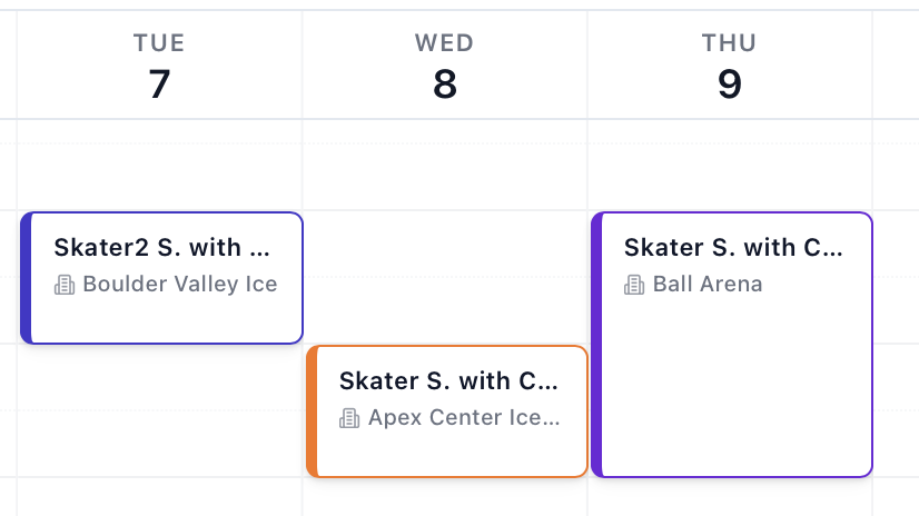
Visual language. Each rink has a color. That color needs to carry through calendars, session cards, and filters. The rinks page is where that visual identity gets established.
Mobile-first actions. On desktop, hover states are elegant. On mobile, hidden actions are frustrating. We needed both experiences to feel natural.
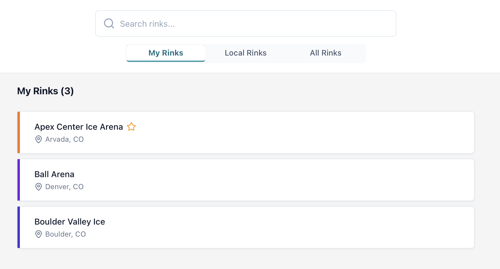
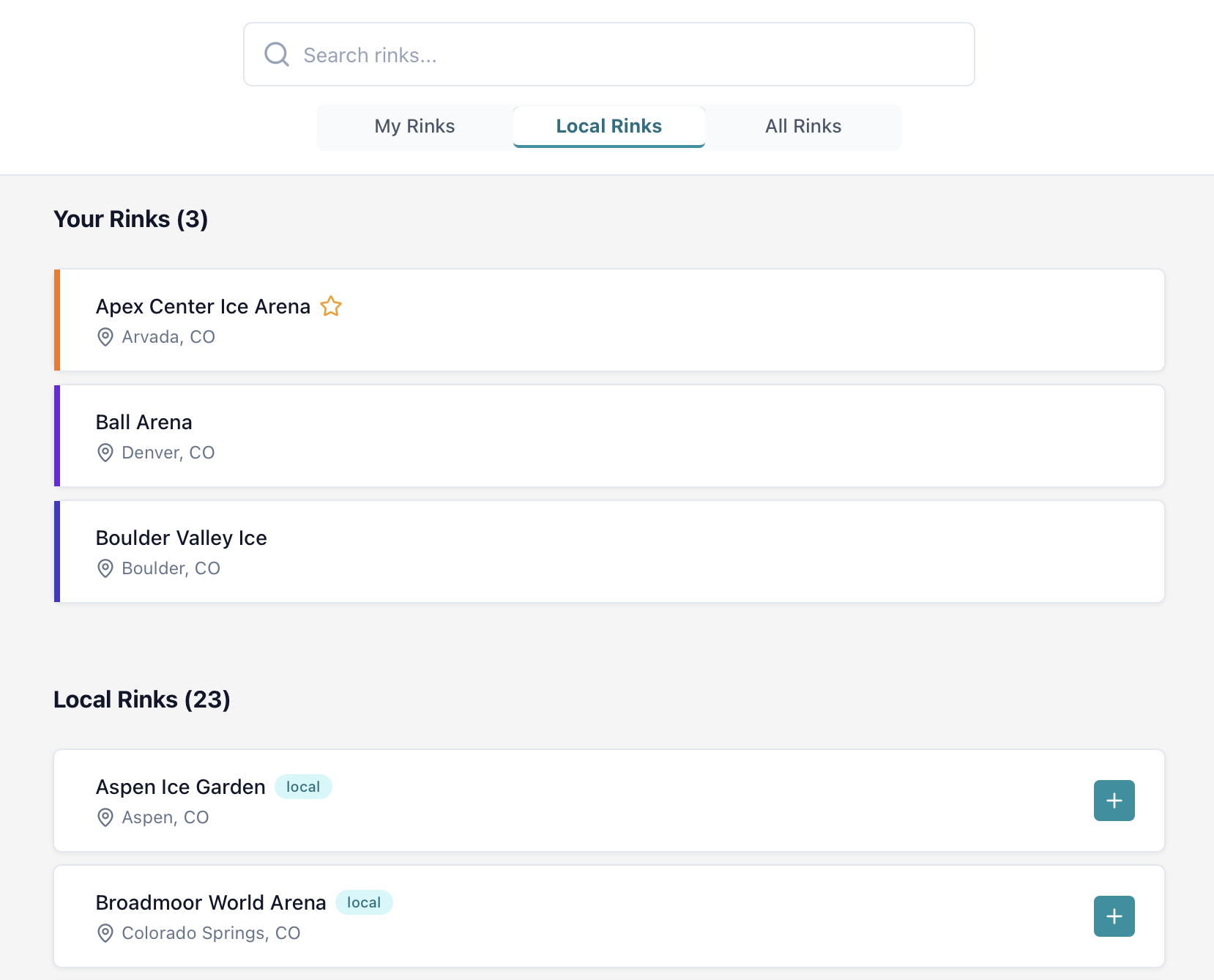
The Three-Filter Solution
We settled on a segmented control with three modes:
My Rinks - Only shows rinks you've added. Your personal subset. Clean, focused, and fast to scan.
Local Rinks - Rinks in your state/province, auto-detected from your profile. Helps you discover nearby venues without drowning in the full list.
All Rinks - The complete directory. Available when you need it, but not the default.
This hierarchy does something subtle: it teaches the interface. New users see their empty "My Rinks" list, click over to "Local Rinks," and immediately understand the system. No tutorial needed.
The Geography Problem
Early versions sorted rinks alphabetically. Technically correct, completely useless.
When you're looking at 200+ rinks spread across multiple states, alphabetical sorting means nothing. Is "Arctic Ice Arena" in your city or three states away? You have no idea.
We added geographic awareness:
- Detect the user's state/province from their profile
- Sort local rinks first, then alphabetical
- Badge local rinks with a subtle "local" indicator
- Make it feel automatic, not algorithmic
The result: local venues rise to the top without requiring zip codes, distance calculations, or permission requests. It Just Works.
Color Coding That Actually Works
Each rink in our system has an associated color. On the rinks page, that color appears as a 4px left border on cards.
For your rinks: Persistent colored border. Visual recognition at a glance.
For available rinks: Color appears on hover. Subtle preview of what it'll look like when added.
This carries through the entire app. See a blue-bordered session on the calendar? That's Pacific Rink. See a green event? That's East Coast Arena. The rinks page is where users learn this visual language.
We debated whether to make colors user-customizable. While that could be a future enhancement based on user preferences, for now we've kept colors consistent for simplicity. When multiple users share schedules, everyone sees the same colors for the same venues, which reduces cognitive overhead and makes collaboration seamless.
The Confirmation Modal Dance
Removing a rink is destructive. Not catastrophic - you can always re-add it, but destructive enough to warrant a confirmation.
We debated inline confirmation ("Are you sure?" text appears below the card), undo toasts ("Removed. Undo?"), and modal dialogs.
We chose modals. Here's why:
Inline confirmations clutter the list and shift everything around.
Undo toasts are great for experts but invisible to cautious users who pause before clicking.
Modals are unmistakable. They interrupt the flow (intentionally), explain what's about to happen, and provide clear Yes/No options.
The modal even explains the consequence: "You'll no longer see this rink in your calendar and schedule views." Not just "Are you sure?" but "Here's what this means."
Performance: The Invisible Feature
The rinks page loads fast. Not "acceptable" fast - actually fast. Sub-100ms on most devices.
How: - Security context caching - User permissions fetched once, reused across queries - Parallel queries - myRinks and allRinks fetch simultaneously, not sequentially - Client-side filtering - Search and filters use Svelte reactivity, no server round-trips - Optimistic UI - Click "Add Rink," see the spinner instantly, update the list before the server responds
Users don't notice any of this. That's the point.
What We'd Do Differently
Map view. We almost built a map visualization. Geographic coordinates are in the database, the Mapbox account is ready, but we cut it. Maybe later. The current list-based approach works, and scope creep is real.
Rink details pages. Right now, rinks are just names and locations. No hours, no amenities, no contact info. We know this will be needed eventually, but starting simple lets us validate the core flow first.
User-submitted rinks. Currently, we manage the rink database manually. Opening it to user submissions sounds great until you think about moderation, duplicates, and geocoding. Someday, but not today.
The "Just" Trap
"Just a list" is a trap. Every "just" hides complexity:
- Just a list (of what? sorted how? filtered by what?)
- Just an add button (optimistic UI? error handling? rate limiting?)
- Just mark as primary (what if they have none? what if they try to unset it?)
The Rinks page took three days because we took every "just" seriously. The result is infrastructure that feels invisible. Users spend 30 seconds adding their rinks and never think about it again - unless they're traveling to a new city, at which point the "All Rinks" filter is waiting for them.
What This Taught Us
Simple UIs are hard. The easiest experiences to use are often the hardest to build. Every decision that seems obvious in retrospect was debated, prototyped, and refined.
Mobile-first isn't a buzzword. If your hover-based interactions don't work on touch devices, you haven't finished designing. Both contexts deserve first-class experiences.
Performance is a feature. Fast apps feel confident. Slow apps feel unfinished. Cache aggressively, query in parallel, update optimistically.
Scope control is survival. We could have built rink details pages, maps, and user submissions. We didn't. Shipping a focused, polished feature beats shipping a sprawling, half-finished one.
The Rinks page is live now. Users add their rinks, set their primary location, and move on to scheduling sessions. Most will never think about it again.
That's exactly what infrastructure should do: work so well you forget it's there.