The calendar page showed coaching sessions. The availability page showed open slots. Both temporal data. Both on the same timeline. But coaches had to switch between pages to see the complete picture.
The Problem
Coaches couldn't see sessions and slots simultaneously. Creating availability on one page, checking conflicts on another. The mental model of "what does my week look like" was split across two interfaces.
We'd organized the app around our database schema (two tables), not around how coaches think about time: "When am I working? When am I free?"
The requirements were clear: see everything at once, distinguish visually between types, unified interactions for both, and handle overlaps gracefully.
The Solution
Visual distinction: Sessions are white cards with colored borders. Slots have colored backgrounds based on status (gray for draft, green for available, amber for pending, orange for partially booked). Fully booked slots are hidden - they become sessions.
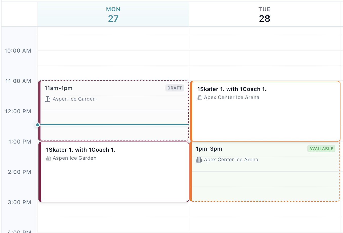
Layout algorithm: When items overlap, they appear side-by-side. A 2pm session next to a 2pm slot? Each takes 50% width. Three overlaps? 33% each. Same algorithm Google Calendar uses, extended for two content types.
The toggle: An "Availability" switch in the header. Turn it on to see slots, off for sessions-only. Default adapts to usage - on if you've created slots, off otherwise.
Unified filters: Filter by rink, coach, or skater - applies to both sessions and slots simultaneously.
Technical Challenges
Two stores, one view: We kept separate stores for events and slots (different APIs, different subscriptions), but pass both to the grid component. Unified UI doesn't require unified data.
Drag and drop: Both types are draggable but have different handlers. We added an isSlot flag - check type on drag start, route to the right store on drop. Same interaction, different outcomes.
Booked slots: Fully booked slots are hidden (they're just sessions now). Partially booked group slots stay visible (still available for booking).
Mobile layout: On desktop, overlaps appear side-by-side. On mobile (under 768px), they stack vertically with slight offsets. Better than cramming into 50% width.
The Results
Coaches stopped switching pages. Conflict detection became immediate. Drag and drop increased. The toggle gets used (30% keep it off, 70% on). Support questions about "where are my slots?" disappeared.
Key Lessons
Database schema ≠ mental model: We had two tables, so we built two pages. But coaches think in timelines, not tables. Organize UI around user mental models, not data architecture.
Layout matters: The overlap algorithm took 3 days and four rewrites. Visual layout is product design - small percentage changes affect usability.
Unified ≠ merged: Separate stores, separate data flows. Unification in the view layer only. Loose coupling with unified presentation.
Visibility should be optional: The toggle was added late after complaints. Unified doesn't mean forced.
Color coding is information architecture: Sessions are white (confirmed reality). Slots are colored by status (potential reality). Visual hierarchy communicates state.
The Takeaway
The calendar now matches how coaches think about time: "here's my week, all of it."
The best interfaces adapt to how users think, not the other way around. Sometimes that means unifying what the database keeps separate, combining what different APIs provide, or building layout algorithms that treat different content types as equal citizens.
One calendar. The whole picture. No more "where are my slots?"